Applying Responsive Retrofitting Techniques to a Fixed-width Site in CSS
Legacy fixed-width sites are bleeding users on mobile. This course shows you the surgical approach to retrofitting responsiveness without a complete rebuild. You’ll walk through real conversion-killing scenarios and the CSS patterns that fix them.
AIU.ac Verdict: Essential for front-end developers maintaining older codebases or inheriting projects built before mobile-first became standard. The 64-minute runtime is lean and practical, though you’ll need solid CSS fundamentals to move quickly through the techniques.
What This Course Covers
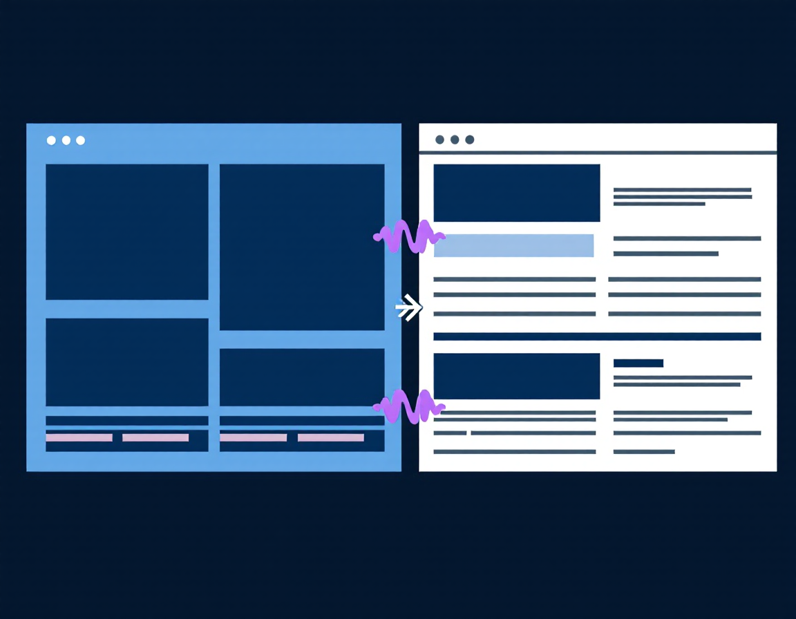
The course tackles the core challenge: transforming rigid, pixel-based layouts into fluid, device-agnostic designs using modern CSS. You’ll learn media query strategies, flexible grid systems, and how to handle fixed-width containers without breaking existing functionality. Patel walks through viewport configuration, breakpoint selection, and the cascade-aware approach to layering responsive rules over legacy stylesheets.
Practical modules cover real-world scenarios: retrofitting navigation bars, adapting image galleries, handling fixed sidebars, and managing typography across screen sizes. You’ll see how to use CSS Grid and Flexbox as enhancement layers rather than replacements, keeping your codebase stable whilst modernising the user experience.
Who Is This Course For?
Ideal for:
- Front-end developers maintaining legacy sites: You’re inheriting or supporting fixed-width projects and need a non-destructive upgrade path to mobile responsiveness.
- Web developers avoiding full rewrites: Budget or timeline constraints mean you can’t rebuild from scratch—this teaches surgical CSS retrofitting instead.
- CSS specialists strengthening modernisation skills: You want to demonstrate expertise in bridging old and new techniques, a valuable skill in agencies and enterprise teams.
May not suit:
- Absolute CSS beginners: You’ll need working knowledge of selectors, the cascade, and box model before this course becomes useful.
- Greenfield project developers: If you’re building new sites, mobile-first frameworks are more efficient—this course is retrofit-specific.
Frequently Asked Questions
How long does Applying Responsive Retrofitting Techniques to a Fixed-width Site in CSS take?
1 hour 4 minutes. It’s designed as a focused skill-builder, not a sprawling survey course.
Do I need to know Flexbox and CSS Grid before starting?
Helpful but not essential. Patel covers both as enhancement tools, though prior CSS fundamentals (selectors, box model, media queries) are assumed.
Can I apply this to WordPress or other CMS-based sites?
Yes. The CSS principles apply universally. You may need to work within theme constraints, but the retrofitting strategies translate directly.
Will this teach me to avoid fixed-width design in future projects?
Indirectly. The course shows why responsive design matters by solving the problems fixed-width creates—a practical argument for mobile-first thinking.
Course by Rachel Wilkins Patel on Pluralsight. Duration: 1h 4m. Last verified by AIU.ac: March 2026.


